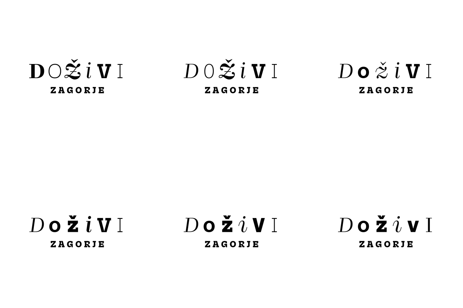
The brief was to create "something different" for a regional tourist board — most competitors lean on nature imagery (hills, rivers, sky) to sell the same attractions. I built the identity around the word itself: "Doživi" (Experience), set in Nikola Djurek's Brenner typeface, with each letter given a different style and combined into playful variations. A bold color palette ties it together, making the message land clearly in any language.
CLIENT: Tourist Board "Srce Zagorja"
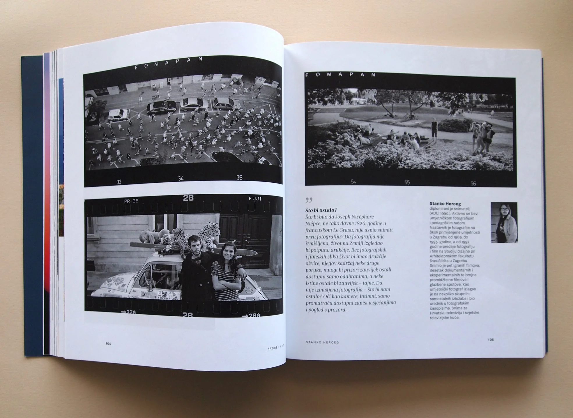
A tribute to Zagreb and a chronicle of the era in which Željko Žutelija worked as a journalist, writer, and intellectual. This large-format book brings together intimate art photography of the city from 18 renowned Croatian photographers.
CLIENT: ArTresor
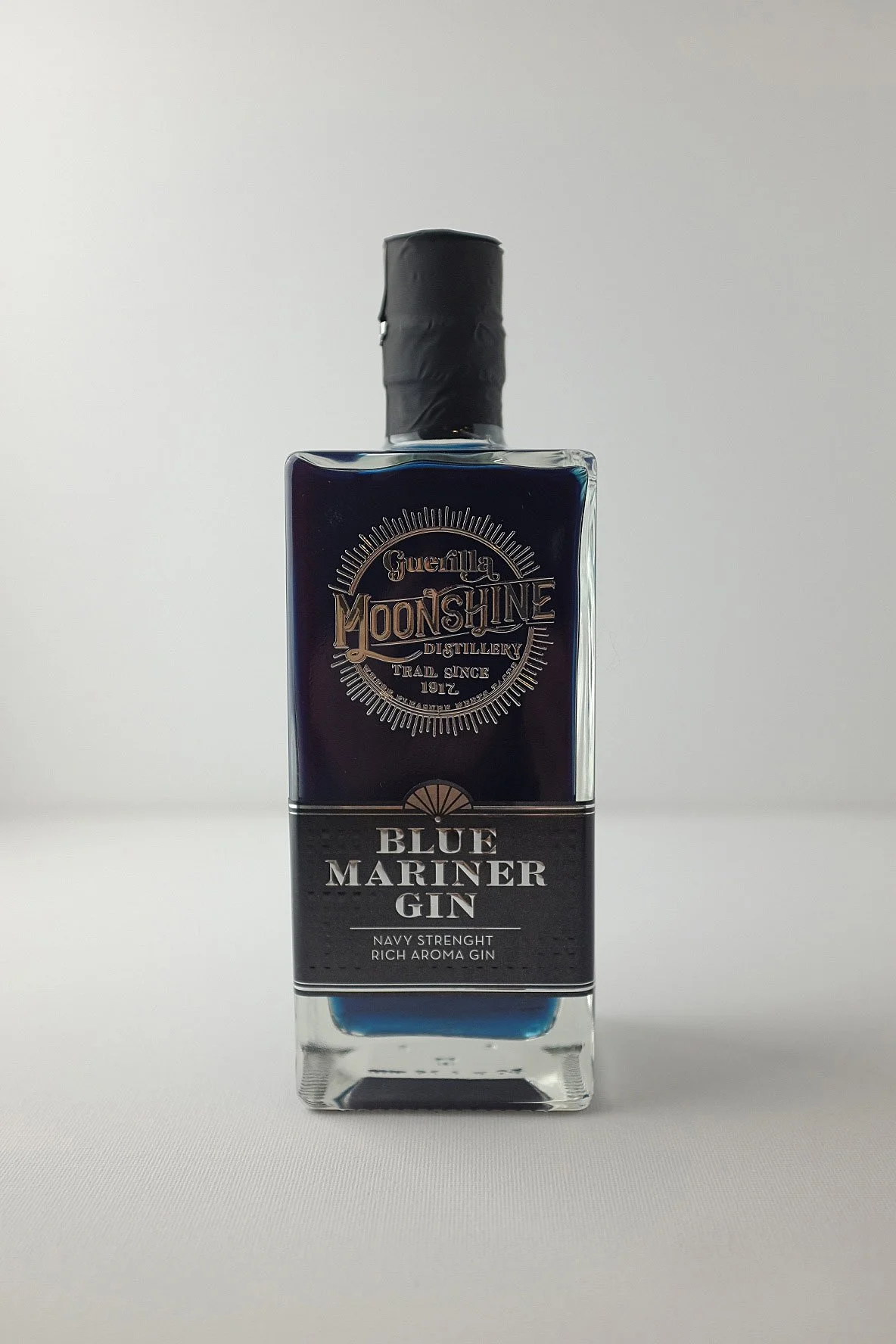
A friend started a distillery and asked me to design the identity and labels. The labels were tricky to produce — printed in China using embossing and foil techniques — but the result paid off: the brand has since won multiple awards.
CLIENT: Moonshine Guerilla
The Croatian Ministry of Agriculture needed a logo for a national quality mark, used to certify higher-quality agricultural and food products. Working from a fairly open brief, I designed the mark and built a full manual covering its application across all types of packaging — a more demanding task than it sounds.
CLIENT: Ministry of Agriculture
Identity for a consulting agency with offices in Zagreb and London. Working from a clear brief, I created a crest-like lion symbol paired with elegant typography by Croatian type designer Nikola Djurek.
CLIENT: Lion SM
A concept for KIA's campaign promoting their electric and hybrid vehicles. I used playful, spike-like typography to suggest electrons radiating from the cars — a proposal still under consideration.
CLIENT: KMAG
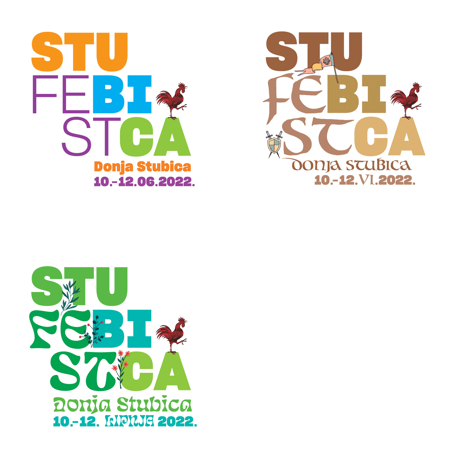
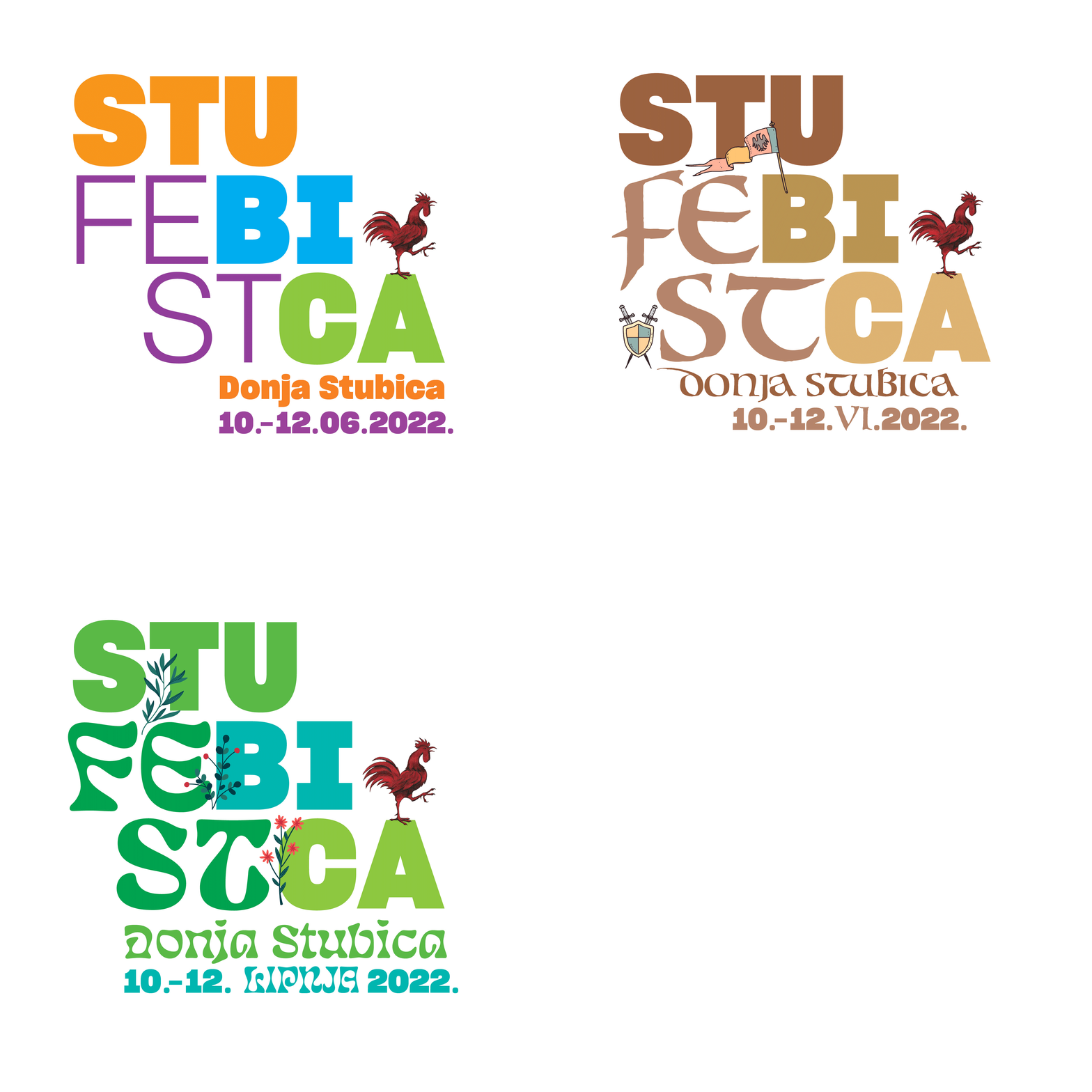
Identity for an outdoor festival built around three distinct concepts, resulting in three logo variations.
CLIENT: Turistička zajednica Gupčev kraj
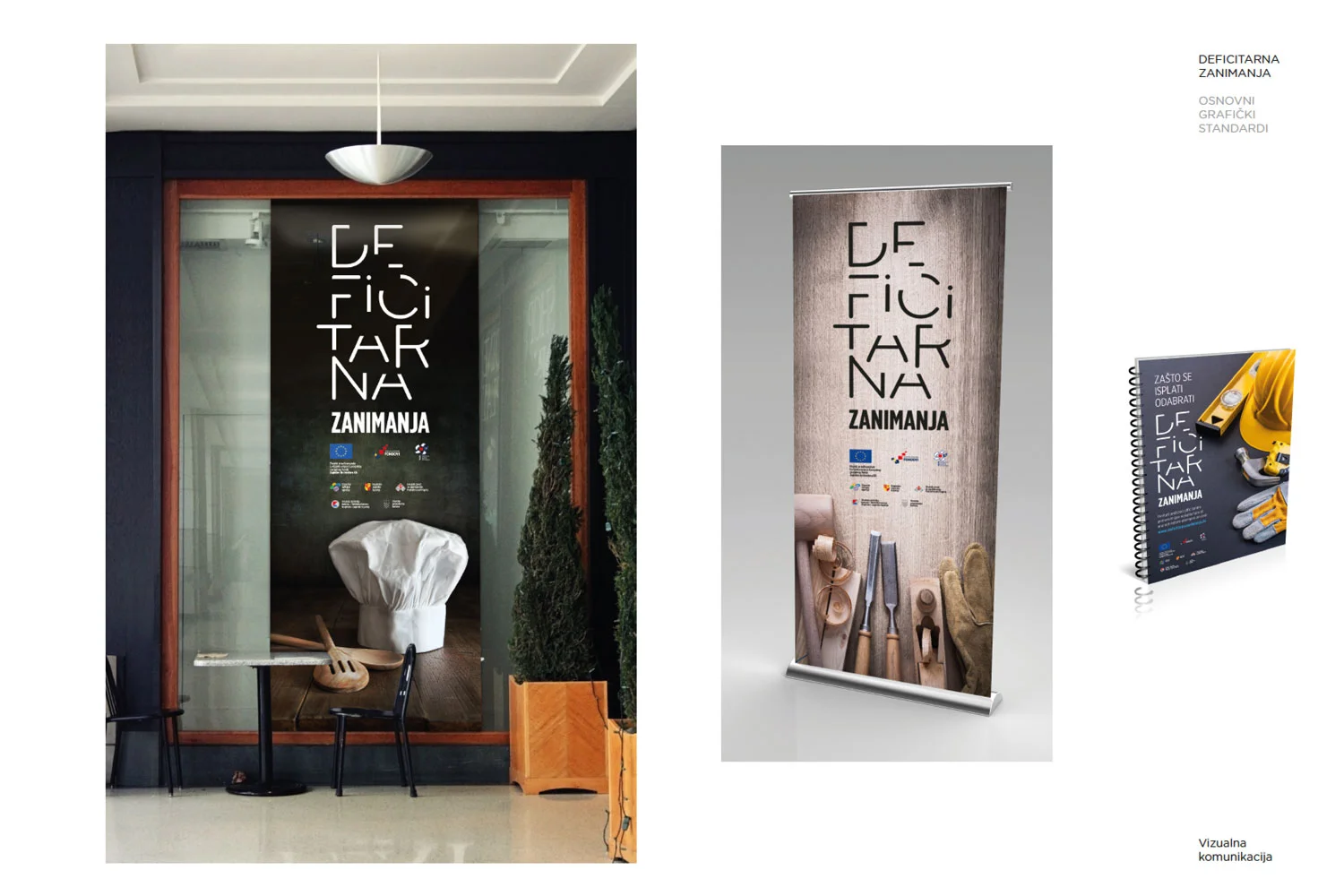
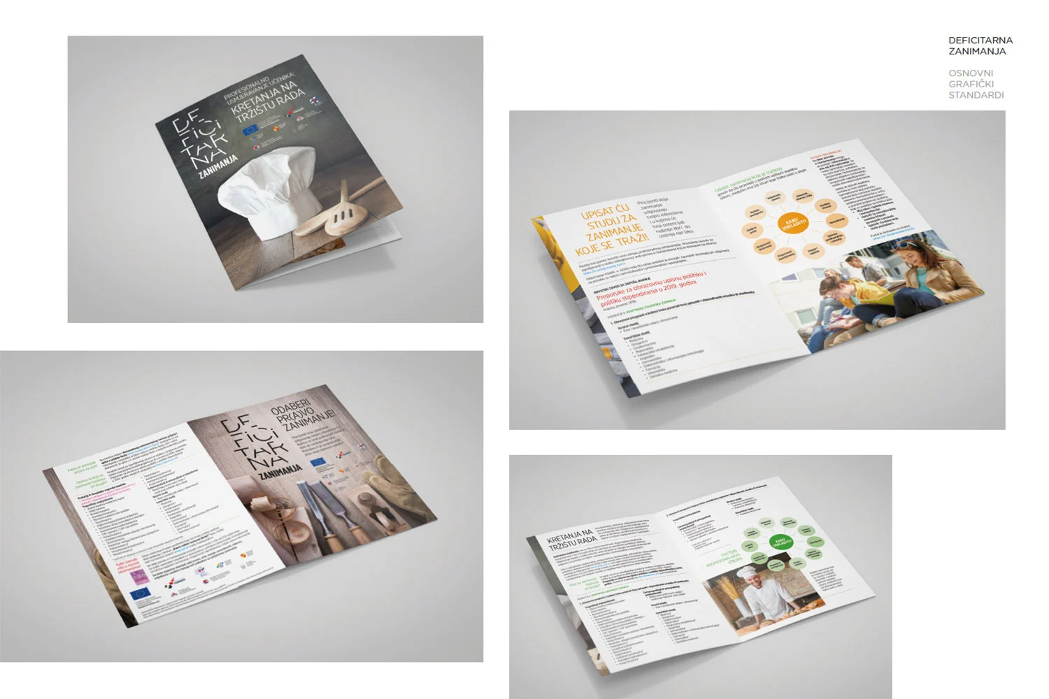
An EU-funded county project aimed at encouraging kids to consider in-demand but less popular occupations. The logo reflects this with "missing parts," and the imagery shows partial frames or profession-specific objects — without ever showing the people who use them.
CLIENT: Zagorska razvojna agencija
A recurring 20-questions interview section for Playboy Croatia, with layout built around strong photography and playful typography.
CLIENT: EuropaPress Holding / Playboy Croatia
A logo for a real estate agency, using negative space to form a house shape. For the agency's administrative arm, Terra Particula Biro, the same negative space becomes a pen tip.
CLIENT: Terra Particula
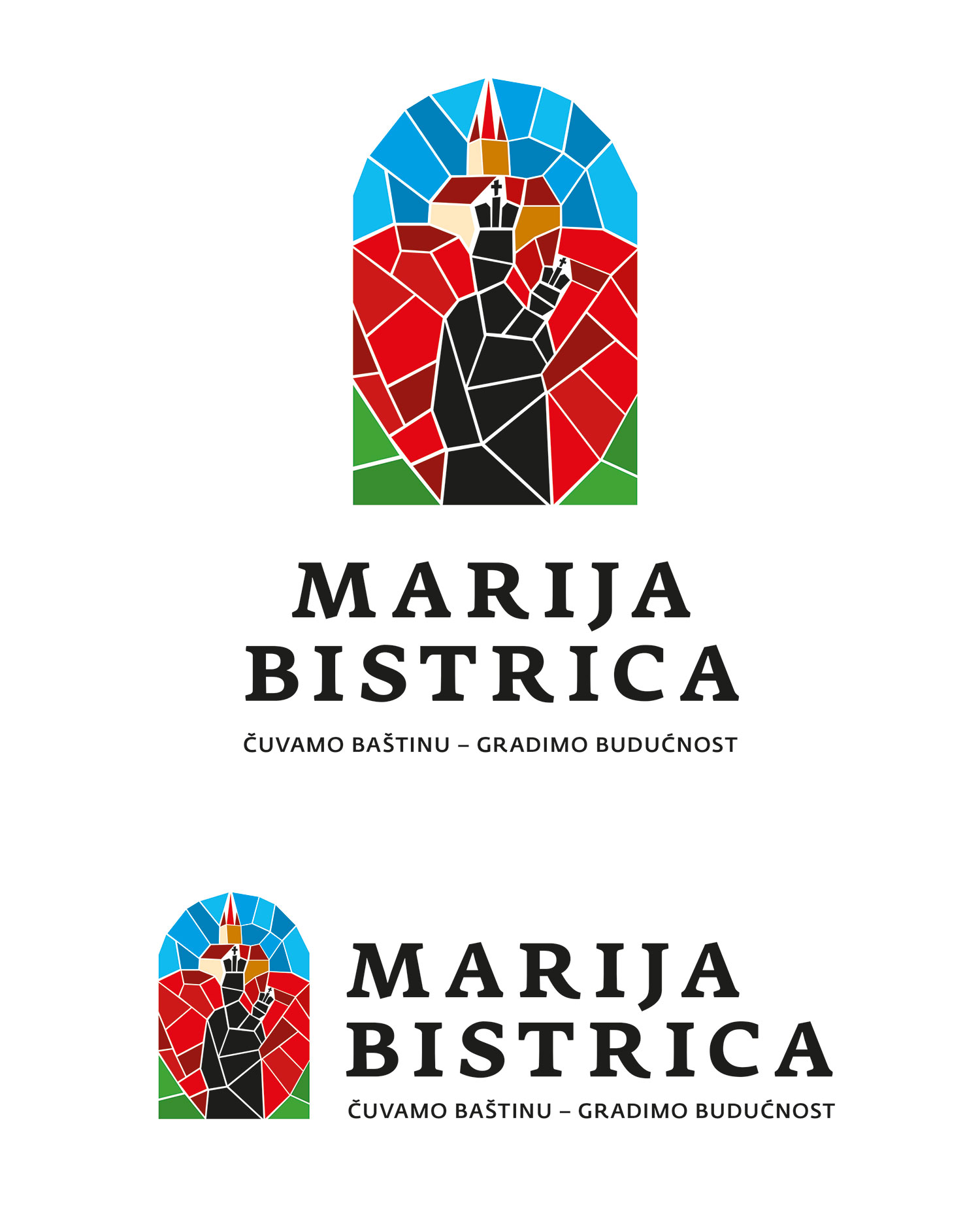
Visual identity for the Tourist Board of Marija Bistrica, home to a historic Marian shrine and the Black Madonna, visited by hundreds of thousands of pilgrims each year. The project won second prize.
CLIENT: Tourist Boards of Marija Bistrica
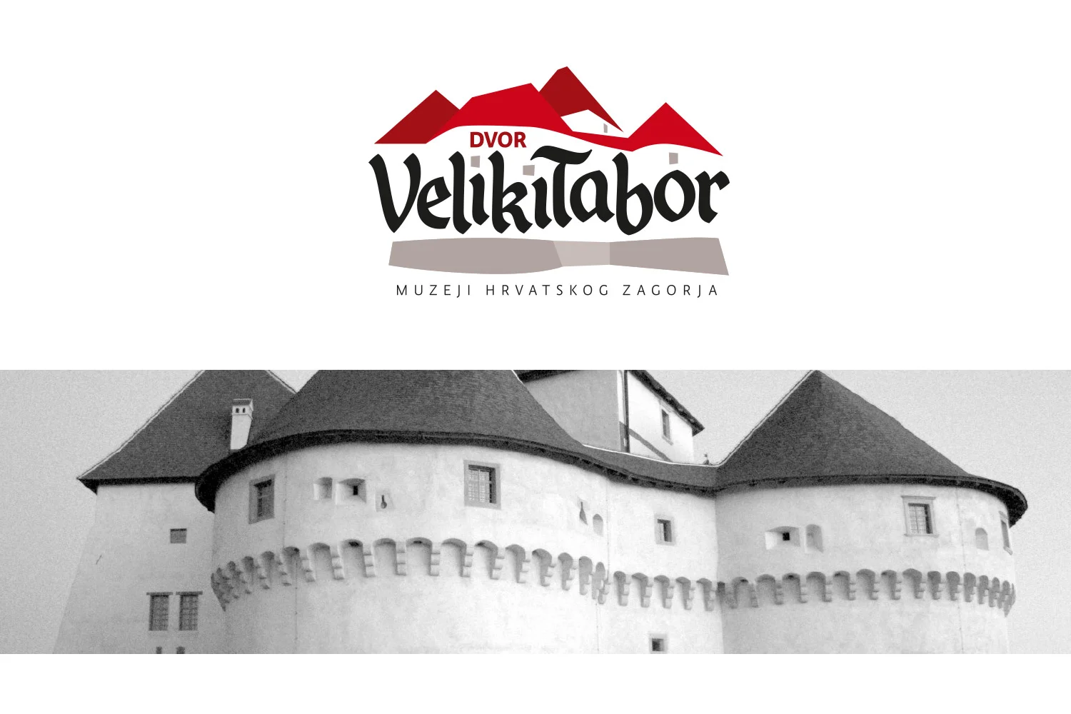
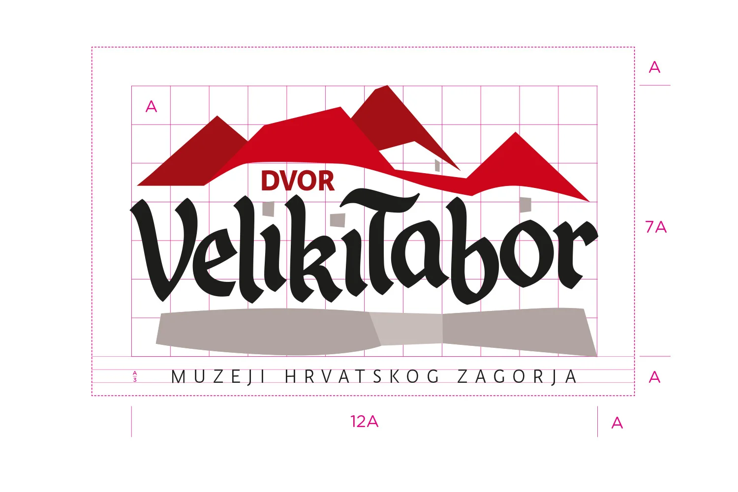
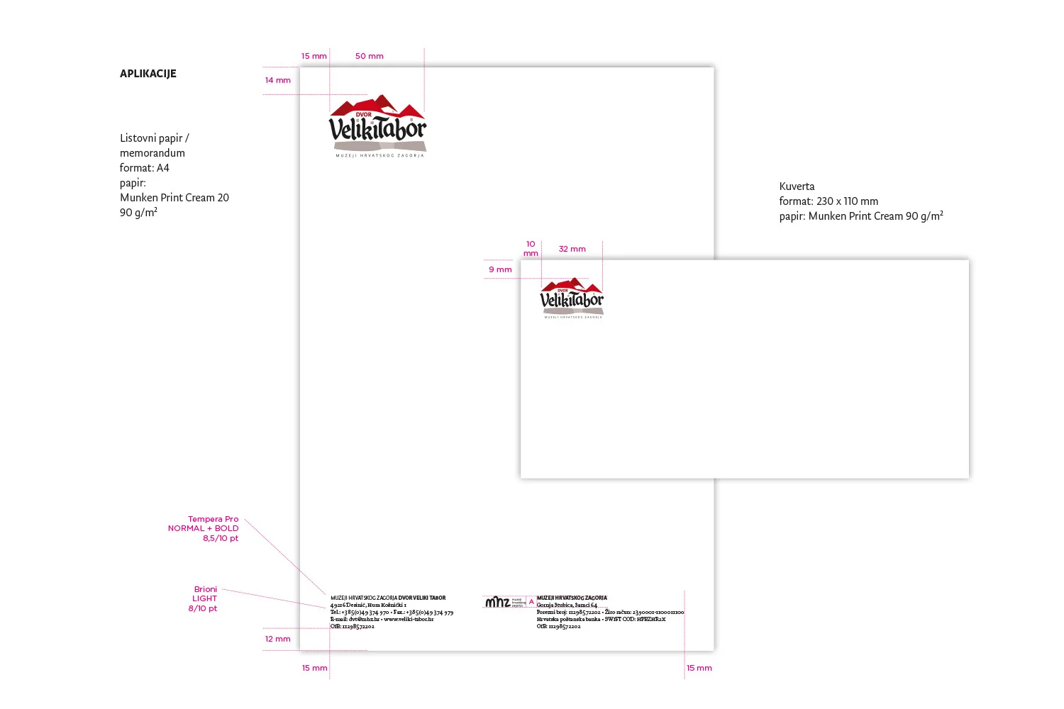
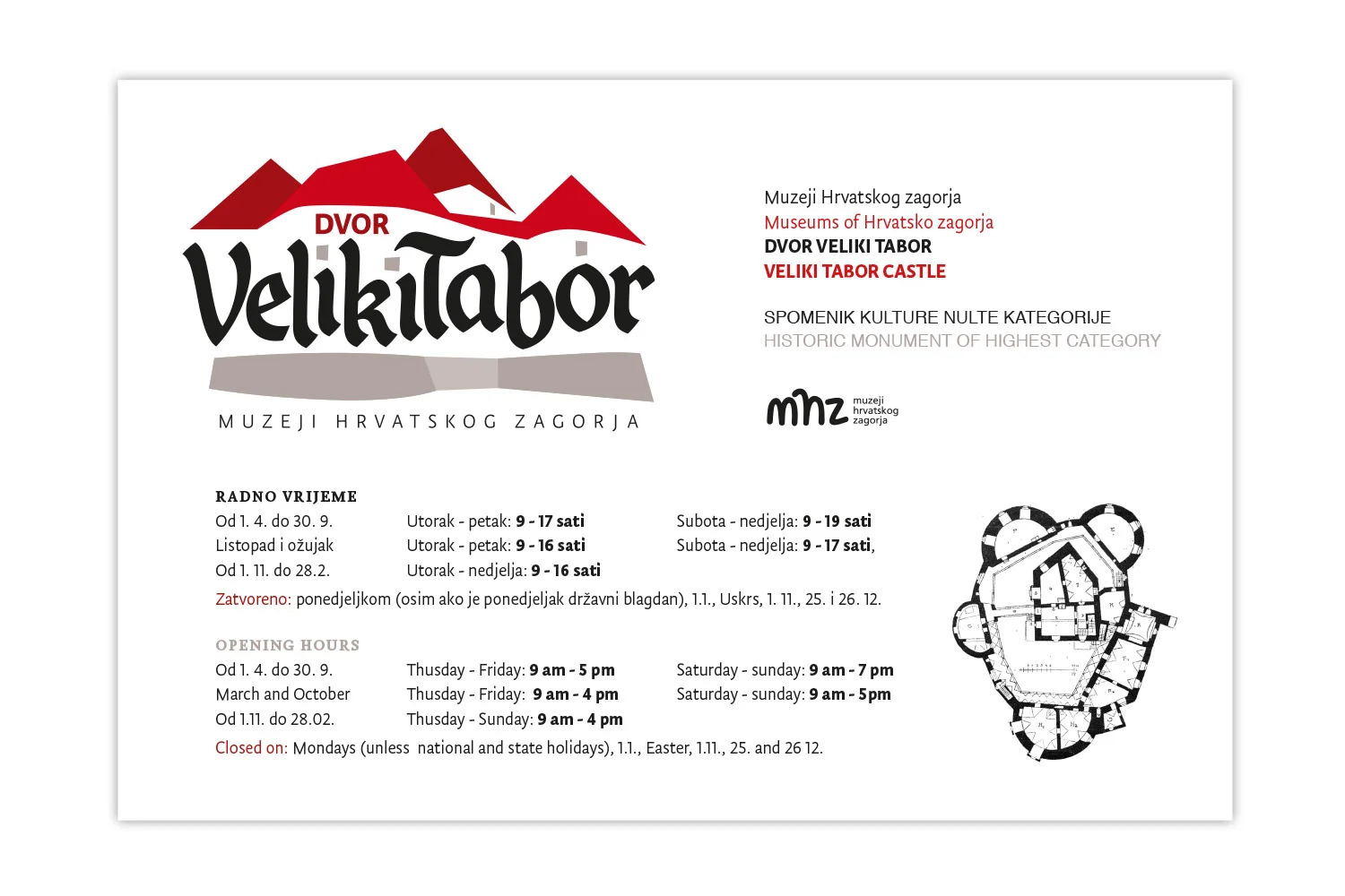
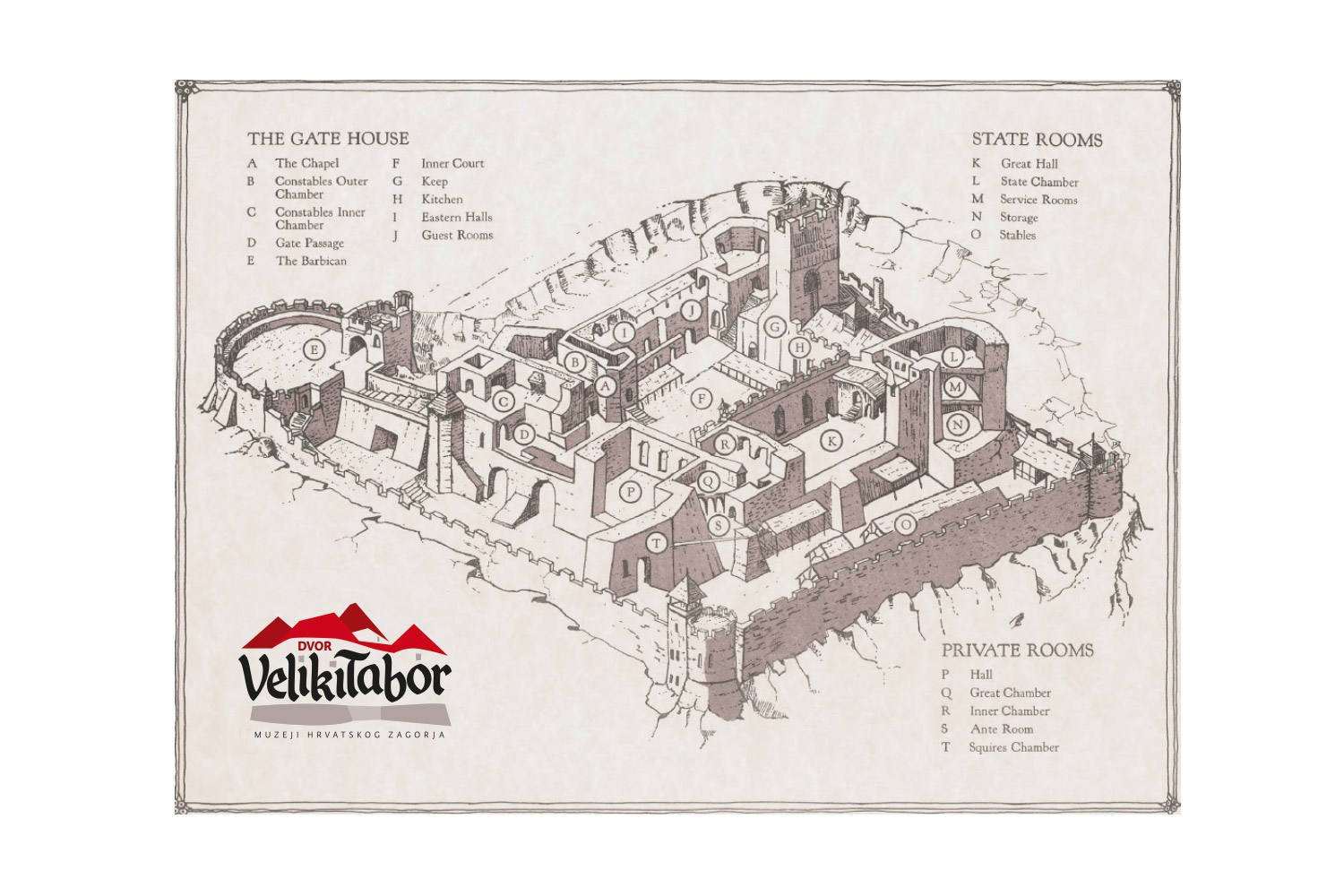
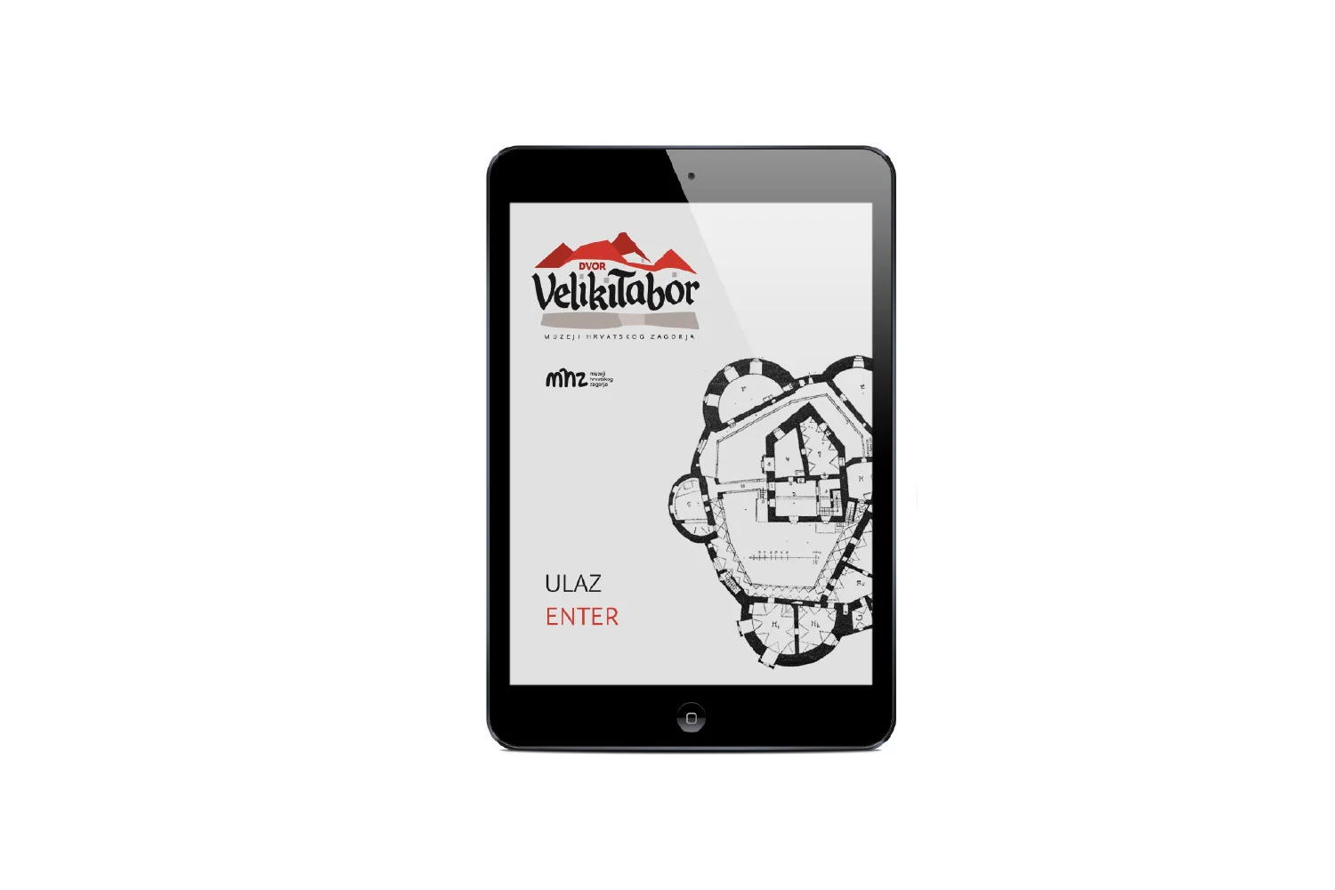
A logo for Veliki Tabor, one of the most significant examples of secular medieval architecture in continental Croatia. The mark is built from the fort's silhouette, filled with custom lettering.
CLIENT: Muzeji Hrvatskog zagorja